Search
Data visualizations
Visualizations designed to provide interesting analyses
The Analytics Platform offers several different visualizations. They add interest and present findings in a way that makes your data more understandable and memorable for your audience. Each visualization aims to present the data in a particular way and assist in analyzing the content.
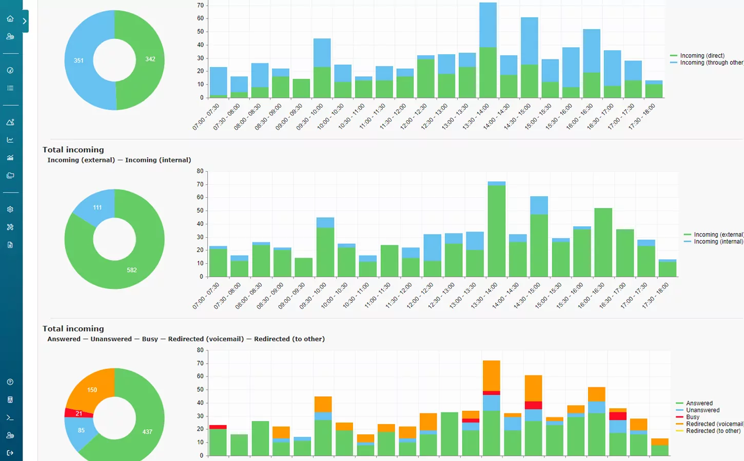
Composition set
Some values in the reports are a composition of other values. As an example, total incoming is often the sum of incoming from both external and internal data. The composition set visualization is designed to show these sets and the distribution of them within a composition.
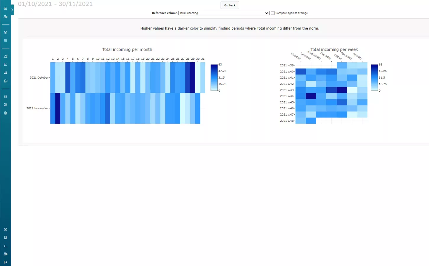
Heatmap
The heatmap visualization is designed to identify patterns or time periods that stand out. Each day is represented with a colored rectangle where the color shows the value compared to the whole period’s minimum and maximum value.
If the Result grouping is set to something other than Total, each measurement object or group will be represented as one row. This makes it possible to compare objects over time, as well as view progress or change.
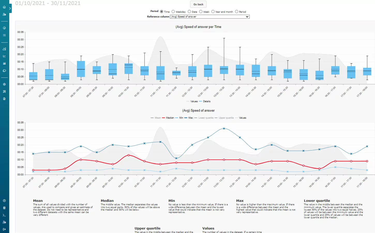
Data distribution analyzer
All the average values in the reports are calculated from a large set. The data distribution analyzer helps you evaluate how representative an average value is. With both a box plot and a line graph, the minimum, maximum, median, and quartile values are represented. With this visualization, it is easier to identify periods where the average value does or does not give a good representation of the actual values.
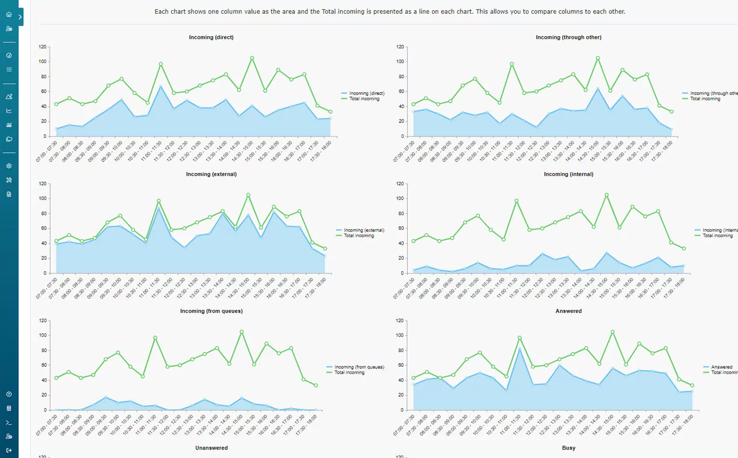
Column comparer
The column comparer draws an area graph for each column value. It is possible to set a reference column, marking it as a line in each other columns graph. Use it to identify correlations between values and check the reason behind different values. As an example, “Did the speed of answer increase because we had a lot more incoming calls or because we had more difficult calls that required a longer duration?”.
Top list
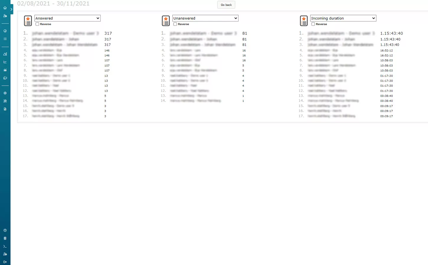
The top list is a simple visualization that lists objects or groups depending on the selected columns’ value. It can quickly identify high or low performing groups or objects and compare different groups or objects with each other.
Dynamic columns
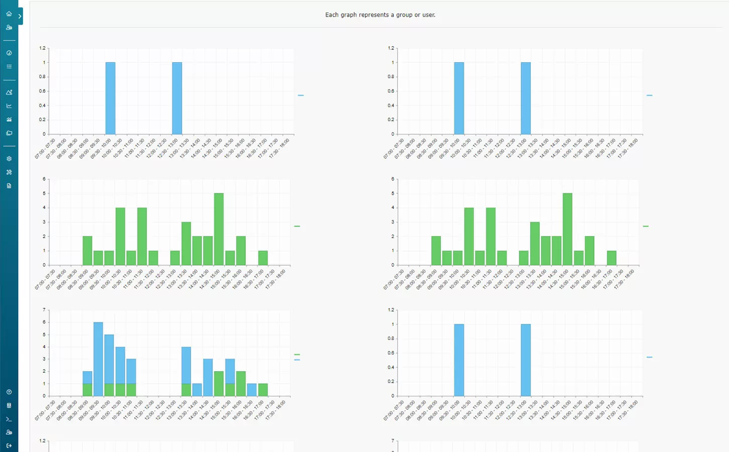
Depending on the report, there might be dynamic columns. The dynamic column visualization is used to present that data. The use case of this visualization depends on the report and column.
Radar chart
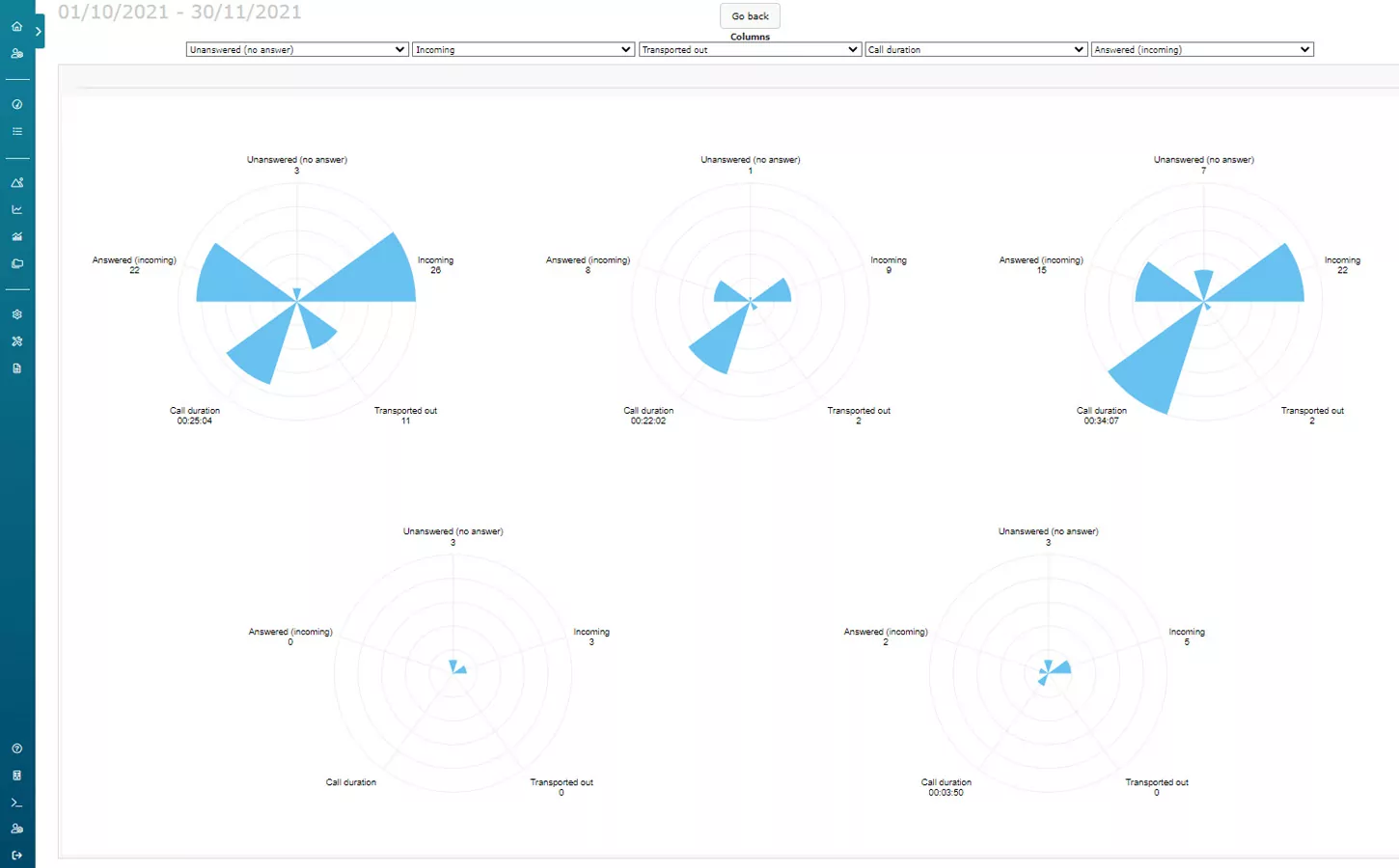
The radar chart visualization compares groups or objects over a set of values. You can select up to five different column values, and each column value will be represented as a cone for each group or object.
Bubble chart
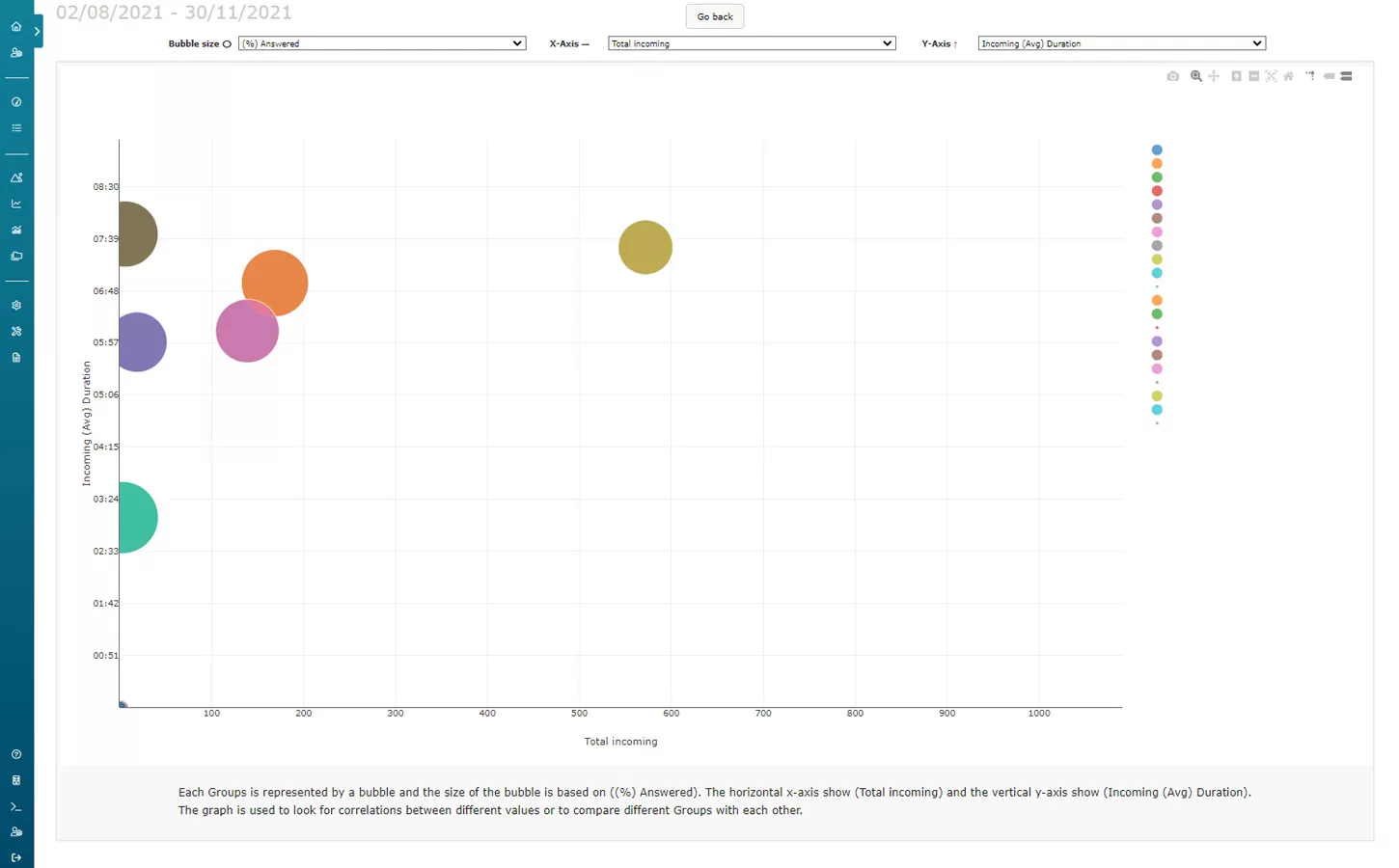
The bubble chart visualization is designed to compare groups or objects. Three different columns can be selected to compare. Each group or object will be represented as a bubble where the size is determined by one column value, and the x- and y-axis can be set to other column values. Besides comparing groups, this visualization also identifies correlations between different columns.
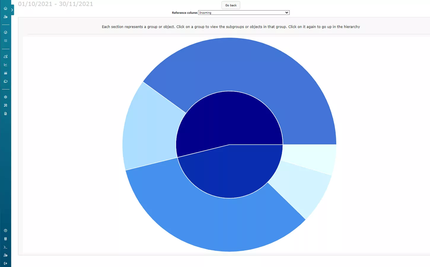
Sunburst
The sunburst visualization provides an overview of groups and objects as well as their significance in the organization. The reference column set defines what value will be used to draw each group’s proportion or object within a specific group. Use it to get a quick overview of your organization and how the communication gets handled.
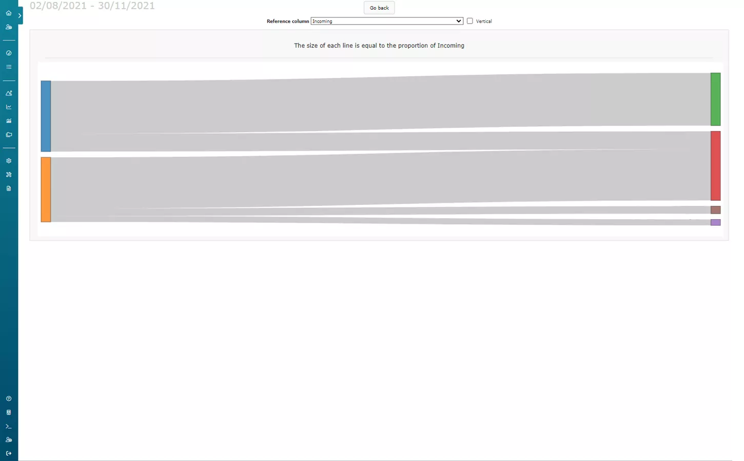
Flow diagram
In some reports, it is possible to view the flow of your data. Maybe a call ends up in a switch, then to an IVR, and then gets forward to a queue before an agent finally answers? The flow diagram visualization presents how many events occur in specific parts of the system.
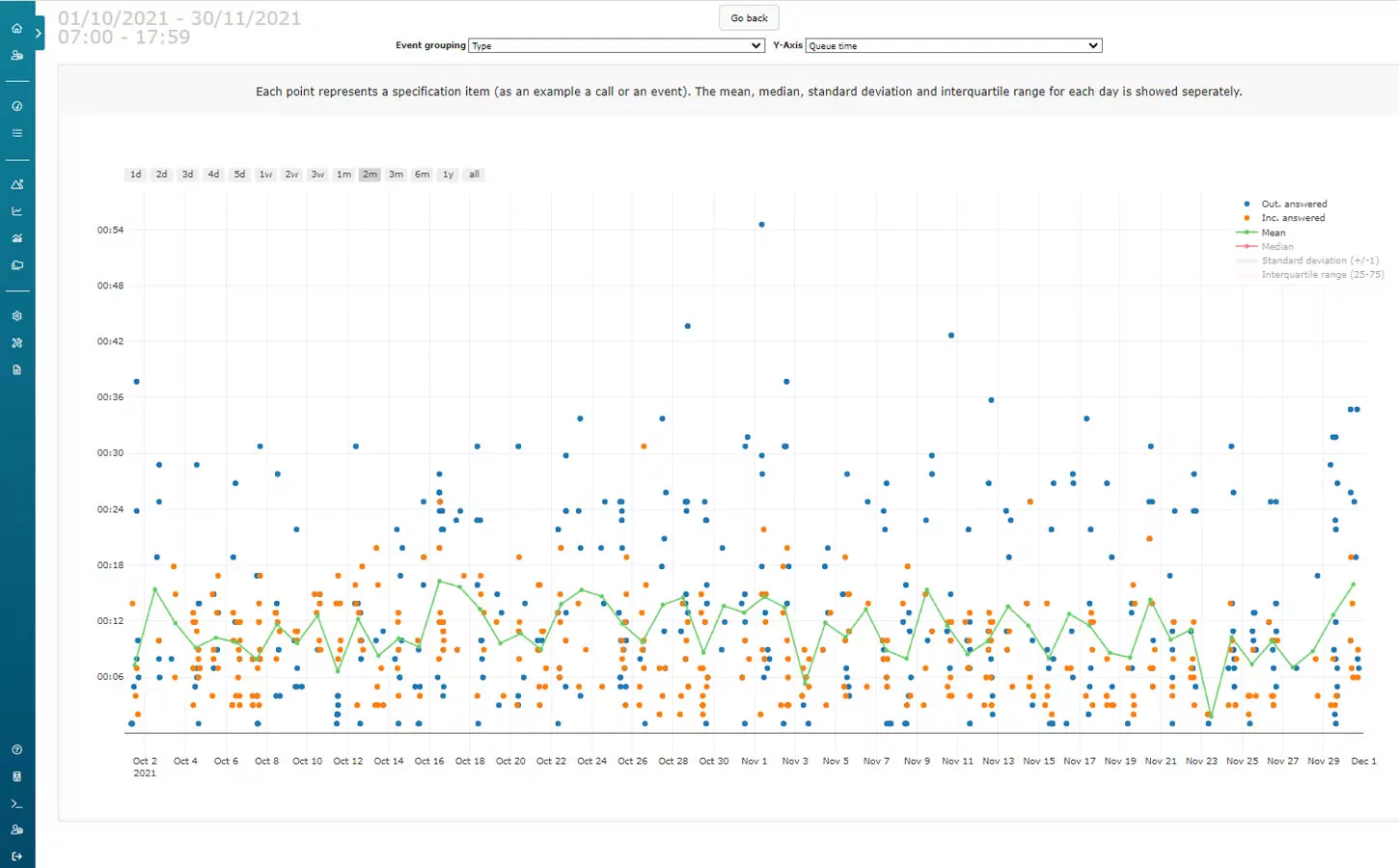
Timeline
In the timeline visualization, each separate call or event is plotted out based on the time it occurred. It is also possible to draw a line for the mean and other statistical measurements for each day.
The timeline visualization provides a graphical way to view the specifications.
Want to know more about Analytics?
Interested in what Dstny Analytics can do for you as a service provider? Fill in this form and one of our representatives will contact you.